Logo Design Case Study
BrosättraBrosättra is a logistics company from Stockholm in Sweden. They needed a new look for their company, but wanted to keep the existing color combination of red and blue. The logo had to represent movement and stability .
CLient
- Brosättra Entreprenad AB
Services
- Logo redesign
Deliverables
- Idea board
- Choice of logos
OTHER
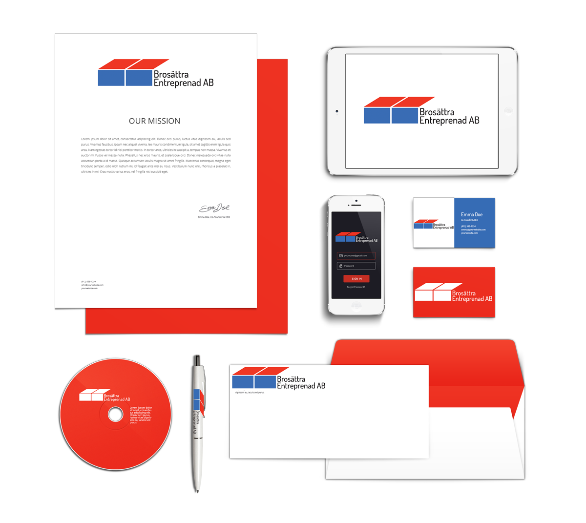
- Sample usage
- Design for print

Style & Imagery
Project Brief
Design a logo for ‘Brosättra Entreprenad AB’
The sister company is ‘Johansson & Söner Åkeri i Märsta AB’
The logo should be similar to the sister company’s logo, but at the same time unique
The same red and blue color as the sister company’s logo should used
The design must work both online and offline (envelopes,
transport slip, stationery, business cards and PR materials)
The design should be simple, elegant and minimalist
The final design chosen was:

