Website Design & Development Case Study
Atelier LuzA jewelry shop in Amsterdam, The Netherlands, specializing in hand-made, fair-trade jewelry. This project required dual language pages, a webshop with checkout and payment gateway. The website was designed to reflect her premises, using elements from the store and showcasing the rugged beauty of jewelry making.
CLient
- Atelier Luz
Services
- We design
- UI / UX
- Website Build
- Webshop Build
Deliverables
- 14 Pages
- Photographs
- Icons
- Styleguide
- WordPress Build
OTHER
- SEO
- Analytics
- Google Maps
WEBSITE
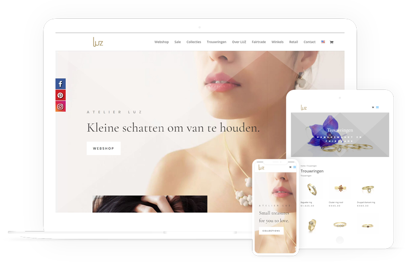
Style & Imagery
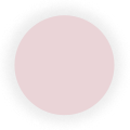
PINK
HEX: #EAD4D7
RGB: 234,212,215
CMYK: 0% 9% 8% 8%

NUDE
HEX: #F2E3DE
RGB: 242,227,222
CMYK: 0% 6% 8% 5%

LIGHT GREY
HEX: #B7B5B3
RGB: 183,181,179
CMYK: 0% 1% 2% 28%

DARK GREY
HEX: #333333
RGB: 51,51,51
CMYK: 0% 0% 0% 80%
Aa
Poppins Regular 32pt
Poppins Bold 24pt
Where a more minimalist aesthetic is required. The ‘Poppins’ font is clean, easy to read and reflective of the ATELIER LUZ brand identity. The font is usually used in ALL CAPS and regular or bold
Coromant Garamond Regular 16pt
Coromant Garamond Bold 16pt
The ‘Coromant Garamond’ font is elegant, legible and yet in keeping with the simple aesthetic of ATELIER LUZ. The font is used in the regular variation and bold for headings and to differentiate hierarchy.
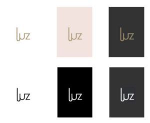
The logo is an integral part of the ATELIER LUZ brand and should be used thoughtfully and consistently.
Most often the logo will be presented in GOLD but can be adapted for use on white, black, pink or dark grey ONLY (see color palette)
The background should always be solid and never placed on a gradient fill or over an image. The logo should never be distorted. Do not use Nude or Light grey as a background color.
See the full style guide here (PDF)
